
Visual Design
It is said art and beauty are in the eye of the beholder. However there are fundamental building blocks to enhance the consistency and effectiveness of designed products. Here are a few of them.

Layout
Layout choices have an affect on how information is perceived. Have you noticed similarities of how websites choose their layouts? There is a reason for that. For years companies have hired UX researchers to A/B test a variance of layouts and find which people prefer and convert towards the best.
Common arrangements also mimic how the eye scans down a page. F & Z eye tracking patterns start top left and move right and down like a typewriter in western global markets and move right to left in others regional markets.
Effectiveness and engagement are not the only factors considered. Balancing in artistic creativity while blending in branding within the right areas are keys to making a product unique.
Alignment
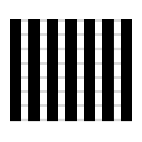
Alignment in design is broken into two factored areas, horizontal Grids and Vertical Rhythm.
Grids have been around almost as long as we have had the written word. The ancient Egyptians followed a design principle called the Canon of Proportions which was a form of grid for their hieroglyphics. Next came movable type, first invented in China about 1040 C.E and in the west in 1450 A.D. With the age of computing and personal devices, the role of the grid is still just as important today. Grids are the invisible guides flowing and directing information into orderly digestible columns.
Vertical rhythm allows for greater readability and a more natural balance as the eye moves down a page. Similarly to grids, this rhythm component adds greater polish and consistency to a design as a key to better typographic layout.
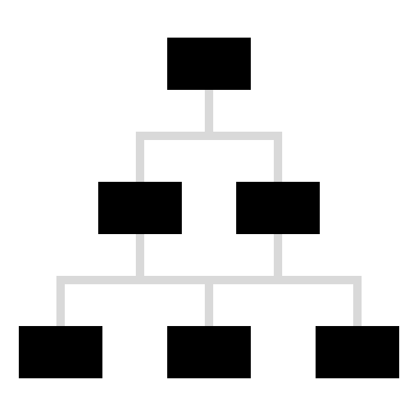
Hierarchy
How important is it for a user to see or interact with an element? Designers use hierarchy to decide what is the priority of each item on a page. This often starts with an ordered list of activities to complete or questions that need to be answered. Home or landing pages are an area where hierarchy is vitally important to sort out. There are often many competing themes and jumping off points that steer the user deeper into the application or site.
Deeper in a user’s journey, it’s helpful for each page to serve a singular objective and purpose. If possible, we want to users to fully understand where they are, what’s being asked of them, and their progress along the journey. For example this might mean we only ask for their “Name”, then “Phone”, then “Email” etc. Reducing the “ask”, allows a user to feel the accomplishment of progression and have more clarity if they make a misstep in that process. That means much of the responsibility of being a designer is organizing and curating information architecture.
Well implemented hierarchy provides instant clarity. When a user lands on a site or app they generally should know in a split second what it is about. Removing interesting but unnecessary features may not be easy however, makes a big impact in the ease of use. When starting with a force ranked list, items higher in the order are provided with more prominent position, size, or contrast.

Proximity
The human brain is a super powerful production engine taking in information and drawing on patterns to help it create order out of seemingly random data.
Proximity is one of the tools the brain uses to draw conclusions about the connections between elements. For example, form layout draws on standardized proximity groupings for form areas like: credit card, address etc. Making use of proximity is good UX and allows users to populate forms more quickly and accurately.
Product and UX design can feel like the job of an interior organizer. When you see a really good designers portfolio, it’s like walking into a well organized house. Everything has a place and each place has a function.
Taking a confusing flow where users are playing ‘Where’s Waldo’ to having them move from step-to-step flows and simply positioning the actions into the correct proximity allows the brain to instantly connect step1 to step 2 and so on.
Ever seen a page where everything you could ever want to do is prominently displayed? How did you feel when searching for your next point of action? Maybe a little confused or frustrated? This is a common mistake made when trying to rush and skip the UX phase. The apps and sites that continue to grow will do the work of curating the most important primary and secondary steps up front in the design. This is what’s called “Information Architecture.“

Balance
After everything is brought into the design it’s now time to balance all the elements into their right balance. What items need to be balanced? The proportion of color, contrast, position, size and spacing between elements can be shifted until all the components are in harmony.
When complete we should have rained in any extremes and made sure to follow platform accessibility guidelines.

Repetition
Users can familiarize themselves with interfaces that use common patterns. Mastery comes from repeating an action until it becomes an instinctive habit. Many items can be repeated to aid consistency like color, type, shape, texture, scale among others.
Another area that is important to focus on is the consistent repetition of voice

Color
Use of color has huge effects on the way we interpret information. Color can drive us to feel emotions that effect product response, effect accessibility and the rate of conversion. One color theory method is the 60-30-10 rule. The rule states that 60% of the design should be a dominant color, 30% should be a secondary color or texture and the last 10% should be an accent.

Contrast
When an item is higher in priority it needs to be highlighted and the contrast of color and size can help order the design. Contrast of typography size and color is also one of the most important factors in supporting inclusive and ethical design for all people. Contrast can highlight better conversion by bringing attention to important CTAs. One interesting trick is to design in b/w to start and once there is a good balance of contrast use the 60-30-10 rule to add color.

Spacing
What allows the design to breath and find harmony? Negative or clear-space is truly not wasted real estate. It has a very important and powerful purpose. This hidden element allows the eye a place to rest and draws attention away from the UI and onto the content. The benefits of spacing are many, here are a few notable ones: Increased Content Legibility, Highlight Call to Actions (CTAs), acts as a separator, creates balance, brings content into tidy focused groups.

Motion
What brings designs to life better than motion? It can convey a change in context during navigation to a new page or make a UI feel faster than it is. There are so many ways motion plays a part to building modern and delightful products. It’s important to understand how timing should be used in different scales according to the size and complexity of your animation. As a general rule of thumb smaller distances and devices should be ~100-300ms. On larger devices objects that must move long distances can be given a bit more time around 300-500ms. Motion can emulate speed and playing with the contrast of fast and slow can add an engaging interaction. Easing in and out of a movement is controlled by the type of on-screen and off-screen movement required. Above all movement should serve a needed function and fit into the bigger picture not just be a distraction but a thoughtful spark of usefulness.